A Feature For Instagram and Twitter
Roll Back Feature


Social Media in this day and age Influences a huge chunk of our lives. We are some how using it to our advantage either through self branding or Content Creation or Entertainment in General, but in a way it definitely Influences decision we make. So we tailor our social Media content to what we want to see and that's good. but how do we make this experience better


As a social media user just like everyone else, I tend to have little or no patience and late reaction. If the content doesn't resonate at that second I tend to scroll or reload, But then after this action I realize, I understand this content and I WANT TO REACT!! but its too late, I've gone past it and I cannot find it due to the number of feeds that come in. How do I solve this?
So what do we really want to achieve from this research, what do we want to be able to deduce after this research that will influence my design decision
We need to find who they are?, How old they might be?, Who is likely to use this feature?, What are their behavioral patterns?
What solutions do we have?, Would It be In-app? Would we create an entire new application for this?, Would we create an Email system for this?, What do we use for this
Do we really need this solution? or is the app better of without this solution?. Are solutions already available for this?
How will this affect Usage of the application in anyway, whether in the development phase or the engagement Phase?
I was able initiate 2 user interviews and they were quick sessions but most of the data used in this case study were from google survey forms I sent out to friends, WhatsApp groups and my social media platforms, I tried to make sure the Questions I asked did not some how Influence the answers and I made sure they were short. I got a total of 57 responses from this Here's a link to the questions I asked
Age Response

96.5% were between the age of 18 and 29,
1.8% were between 0 and 17,
1.8% were between 45 and Above
Between 5 Social media platform what were the most used

78.9% used Instagram,
49.1% Used twitter ,
19.3% Used Linkedin
14% used facebook and then 22.8% used Ticktok
One a scale of 1-5, I asked how much they used social Media

50% Picked 4,
21.4% Picked 5 ,
25% Picked 3
3.6% Picked 2

66% of users change their minds to engage a content after Reload, This answers the Question on how valid this problem is.

59% of the users reload their feed as a result of the end of content, 45.6% Subcousiously, 40.4% Network, 22.8% Accidentally, This Clearly give context to what scenario we want to use this feature

52.6% of the users lose the content they want to engage with after reload. This gives insight on the fact that we do not memorize enough information to find such content.

40.4% of users rarely find content they lose after they reload (Exempting saved content )
From the insights Above it would be unrealistic to create personas based on the all the insights gotten, I then narrowed it down the insights to create a persona based on the majority of my findings

I searched and asked a couple of friends if there were third party Apps or any other solution for this and the answer as NONE, I am still surprised till this day, this just fuels my process the more
From the research and personas given, I was able to finally come up with a problem definition answering the WHO?, WHAT THEY NEED? AND WHY THEY NEED? question
"Social Media users need a feature that would help them roll back to the previous state of content after reload "
These are the key things I want the user to feel using these feature Include
Jakob Nielsen’s third usability heuristic for user interface design is user control and freedom. This principle states:
Users often choose system functions by mistake and will need a clearly marked “emergency exit” to leave the unwanted state without having to go through an extended dialogue. Support undo and redo.
Users should be able to know how to use without to much thought or in depth thinking
Users should be able to use this feature without some how disrupting the flow and experience of the entire application
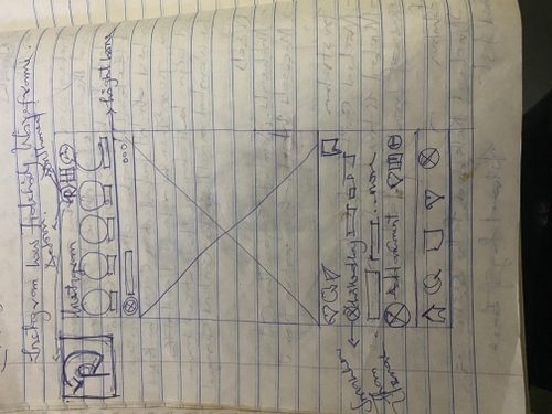
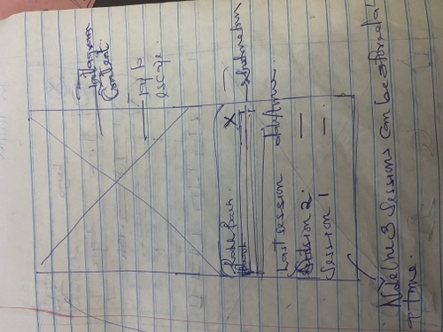
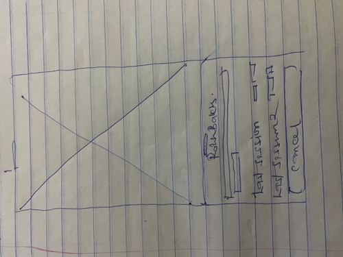
So starting my sketching, I decided I would be designing or Twitter and Instagram since majority of the users where in that space according to the research above

.jpg)
.jpg)
.jpg)


.jpg)
For the design of this feature one thing I had to keep in mind was maintaining the Design system and language or both Instagram and Twitter. This influenced the visual design and Placement of element. These companies have also Followed the human interface guideline for iOS for the Placement of the elements on the screen,
The Fonts Used were Chirp for Twitter and Neue Helvetica for Instagram, The brand Colors were Consistent
Icon design is not really my strong point, But I had to learn and Use shapes to help create an Icon that was peculiar to that Purpose while Maintaining the Brand Identity
On the design it was placed on the right top corner because its a feature that is not used as often as the features on the nav bar and It is used more than the features in the settings

Usability testing was the next stage, I was able to get 4 users to test letting them rate the experience on a scale from 0 to 5,then giving a comment
Score : 4
Comment :"Good experience but how will this affect the developers"
Score : 3
Comment :"Try and Add thumbnails to those sessions"
Score : 4
Comment :"Another use case is when you open Instagram, the state should save "
Score : 4
Comment :"Let the Number of sessions be 1 instead"
I Understood the Feedback I got and Implemented them in other to test again, Below are the changes made

I couldn't Implement the Thumbnail on twitter, because that it'll be hard for the user to see the tweets, If its so small
So after conducting 2 Usability Tests, showing the 2 Iterations I had, One user picked the thumbnail and the other picked the previous Iteration.
The best option to go for will be the original solution , I picked this because implementing this will reduce cost and the feedback is just from one user which is Important but, I would need a larger audience or Live data from the first and second Iteration to get the most Result
This project was quite interesting and exciting at the same time ,I faced a few challenges which included always having to rephrase the context of the design when testing, getting a really Inaccurate feedback because its a new concept and there is no competition.
I think we can have better feedback once the feature is launched and the I would gain more clearance on how to improve the UX of this feature
Regarding this Case study do not hesitate to send feedback or contact me, Thank you!!